A bivariate choropleth map uses color to show its data. This is a map of the U.S. showing each president votes in each state.
https://blogger.googleusercontent.com/img/b/R29vZ2xl/AVvXsEjF-3qOfcTR62npZfehMB_AfaKfUal3IMVaedLd_HHpdY9Xpl-OKZei9TZ2WSWYgczxGZCWqJEPBLE52yayDEP3yCmRiO9ICptu5LN9OHDspTEkK4KYVXHbV0LuNYZWFPqXujcSMDURvS2g/s400/Chlorpeth.png
Friday, July 30, 2010
Unstandardized choropleth maps
An unstandardized choropleth map has no certain type of ranking there is no order. This unstandardized choropleth is showing no order of the state distribution.
http://mcatfordummies.blogspot.com/2008/08/unstandardized-choropleth-maps.html
Standardized choropleth maps
Information in choropleth maps are already standardized. This show comparison of distribution in certain area's. This is a standardized choropleth map of the U.S. showing the population per square mile by state.
http://vin25maps.blogspot.com/2009_04_01_archive.html
Bilateral Graph
Unclassed choropleth map
Unclassed choropleth maps use shading to show data. The technique is not up for using yet because it does not give direct information.
http://kelsocartography.com/blog/wp-content/uploads/2009/03/datalayers.jpg
Thursday, July 29, 2010
Classed choropleth maps
Index value plot
This is an index value plot. An index value plot show the discrepencies between data information. This index value plot shows the differnt market value each year.
http://kmuletmapcatalog.blogspot.com/2009/04/index-value-plot.html
Stem and leaf plots
This is a stem and leaf plot. A stem and leaf plot is a method for showing the frequency with which certain classes of values occur. This is a stem and leaf plot of people ages at a family reunion.
http://www.eduplace.com/math/mhm/5/06a/index.html
Triangular Plot
Range graded proportional circle map
A range graded proportional circle map show the relationship of circles in the range of data.
http://indiemaps.com/blog/2009/10/classed-cartograms/
Windrose
continuously variable proportional cirlce map
A continuously variable proportional circle map is a map that uses circle to show data points.
This is a proportional map of the United States.
http://similaritymatrix.blogspot.com/2009/11/continuously-variable-proportional_29.html
This is a proportional map of the United States.
http://similaritymatrix.blogspot.com/2009/11/continuously-variable-proportional_29.html
Climograph
DOQQ
This is a DOQQ map. DOQQ stands for digital orthoquarter quad. This is a red color DOQQ of a 500 year food plan.
https://blogger.googleusercontent.com/img/b/R29vZ2xl/AVvXsEhOsevynEY_1snYq9QiFZdU7wlf99wrjux-Mvu_4mA0JB43pJg4VODIBGlIAfQojAa-DSWM7JUfVOU6xFlR6mxC0VFrH6a-IQNf1ahkeOZ_hNg5iGgvzR7vrgz0EZok9YB6xe4gYJW6qzA8/s400/DOQQ.jpg
Population profile
This is a population profile. A population profile is a chart showing the number of people as a function of their ages.
http://dictionary.reference.com/browse/population+profile
DEM Map
DEM map stands for digital elevation model. DEM is a digital reprensentation of the atomosphere on the ground. This is a DEM map of Colorado.
http://commons.wikimedia.org/wiki/File:Colorado.png
Monday, July 26, 2010
DLG Map
DLG stands for Digital Line Graph and shows vector data from the USGS. This is a DLG map of Columbus, Georgia.
http://ga.water.usgs.gov/olympics/columbus.dlg.gif
DRG Map
Isopleth Map
Isopach Map
Isopach Maps show the different thicknesses in rocks underground. They are most commonly used by people trying to get oil. This is a map of the Rio Blanco Tephra Deposit.
http://www.geo.utexas.edu/faculty/barker/kempter/rbtephra.html
Isohyet Map
An Isohyet map uses lines that show rainfall amounts. This is an Isohyet map of Australia.
http://www.isohyet.com/
Isotach Map
An Isotach map uses lines to show different wind speeds. This is an Isotach map of the United States.
http://www.whitsettnc.com/My_Homepage_Files/Download/WhitsettLighting_files/image004.jpg
Isobar Map
Wednesday, July 21, 2010
Histogram Map
A Histogram is a map that's two demensionnal and shows the frequency of data. This map shows hours delayed in traffic per year.
http://www.coolinfographics.com/storage/post-images/One%20Day%20in%20America%20-%20TIME.jpg
Star Plots
Star plot compares relationships between multiple variables. This is a Star plot that is used for Geochemistry.
http://members.iinet.net.au/~geotech/images/StarPlot1.jpg
Correlation Matrix
Correlation Matrix map shows the relationship shows the similarities between multiple variables instead of just two. This map is showing the realtionships between genes.
http://www.livestockgenomics.csiro.au/Genome_to_Phenome/matrix32_blocked.png
Similarity Matrix
LIDAR Map
A LIDAR Map is map that uses remote sensing to detect elevation. In this map it shows certain areas colored to determine where elevation is.
http://farm1.static.flickr.com/25/43339456_4168e661bc.jpg
Monday, July 19, 2010
Doppler Radar
Doppler Radar sends out waves to detect data about moving objects, like moisture in the atmosphere. This is a Doppler Radar map of San Antonio showing rainfall amounts.
http://i147.photobucket.com/albums/r298/alamocitywx/radar5_2_05-1.png
Infrared Aerial Photo
Infrared Aerial Photos are taken by planes or satellites using special film and sensors to detect vegetation or other features in an area. This map is showing vegetation in the Everglades National Park.
http://sofia.usgs.gov/publications/fs/2004-3016/images/fig3x.jpg
Cartographic Animation
Cartographic Animation Maps show data in animated form. In this picture from a custom cartographic animation, it shows weather change in North Florida.
http://www.weather.com/weather/map/interactive/32304:4
Isoline Map
Isoline Maps use lines to display certain values of data. In this map, the lines show different areas of temperature.
http://www.learner.org/jnorth/images/graphics/u-z/weather_isotherm032401.gif
Choroplrth Map
A Choropleth map is map that shows shading or colors to determine the measurements of a variable. This map shpws the increase in divorce rates in the United States between 1980 and 1990 using different shades of blue.
http://www.pop.psu.edu/images/gia/maps/changeanim.gif
Wednesday, July 14, 2010
Dot Distribution map
In a Dot Distribution Map dots are displayed to show a certain number of a feature in an area. This is a Dot Distribution Map of China showing population. One dot equals 50,000 people.
http://depts.washington.edu/chinaciv/geo/people.htm
Hypsometric Map
A hypsometric map is a map that shows elevation using different coloring and shading.
This is a Hypsometric map of Egypt.
http://www.reliefshading.com/colors/hypsometric.html
This is a Hypsometric map of Egypt.
http://www.reliefshading.com/colors/hypsometric.html
PLSS Maps
PLSS stands for public land survey system. In PLSS maps, land is divided into rectangular plots. This is a PLSS map of Mississippi.
http://www.rootsweb.ancestry.com/~alfrankl/plss_basemap_alabama.jpg
Cadastral Maps
Topographic Map
Planimetric Map
Wednesday, July 7, 2010
Topographic Map
A Topographic Map is map that shows elevation.
http://www.mapsofindia.com/maps/india/map-of-india-physical.gif
Wednesday, June 16, 2010
Box Plot
Thematic Map
Scatter Plot
A Scatter plot is diagram showing two variables of a set of data. A scatter plot is useful to see if the variables have a relationship. In this scatter plot, there is no relationship between the two variables.
http://www.mzandee.net/~zandee/statistiek/stat-online/chapter4/pearson.html
Monday, June 14, 2010
Univariate Choropleth Map
Nominal Area Choropleth Map
Statistical Map
Monday, June 7, 2010
Mental Map
Mental maps are drawn by people based on their own knowledge. They show key places that one thinks is important. This particular map shows a homeless person's view of Amsterdam.
http://fasica.altervista.org/adam/adam_en.htm
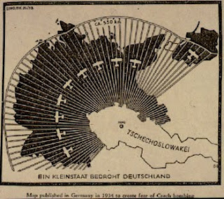
Propaganda Map
Propaganda maps are used to send a message. How you percieve a propaganda map can emotionally make you feel a certain way about what it is trying to portray. A propaganda map is a powerful tool that tries to get people to take action.
The map above is showing that if Germany does not hurry up and take over Czechoslovakia, it will be able to launch planes and perhaps bomb Germany.
http://longstreet.typepad.com/thesciencebookstore/2008/08/propaganda-maps.html
The map above is showing that if Germany does not hurry up and take over Czechoslovakia, it will be able to launch planes and perhaps bomb Germany.
http://longstreet.typepad.com/thesciencebookstore/2008/08/propaganda-maps.html
Flow Map
This is a Flow Map of how to make a peanut butter sandwhich. A Flow Map shows a step by step process and shows a relationship from the previous step to the next step. The map shown above is a very detailed map that is easy to follow.
http://www.nhcs.k12.nc.us/ogden/ThinkingMaps.html
Subscribe to:
Posts (Atom)