A box plot is a diagram of data that shows the four quartiles of the data set. Is also shows the lowest vaule, the median, and the highest value. In this box plot, the median snow depth is seventy-five.
 A Scatter plot is diagram showing two variables of a set of data. A scatter plot is useful to see if the variables have a relationship. In this scatter plot, there is no relationship between the two variables.
 Mental maps are drawn by people based on their own knowledge. They show key places that one thinks is important. This particular map shows a homeless person's view of Amsterdam.
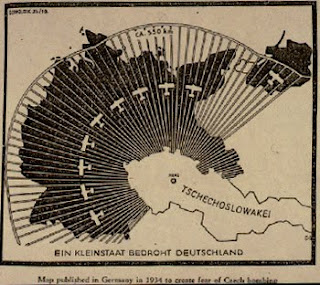
 Propaganda maps are used to send a message. How you percieve a propaganda map can emotionally make you feel a certain way about what it is trying to portray. A propaganda map is a powerful tool that tries to get people to take action.